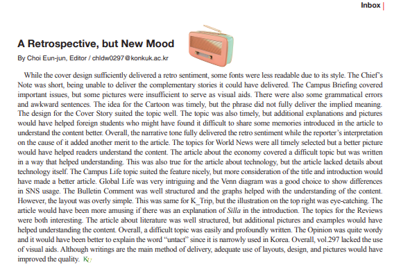
While the cover design sufficiently delivered a retro sentiment, some fonts were less readable due to its style. The Chief’s Note was short, being unable to deliver the complementary stories it could have delivered. The Campus Briefing covered important issues, but some pictures were insufficient to serve as visual aids. There were also some grammatical errors and awkward sentences. The idea for the Cartoon was timely, but the phrase did not fully deliver the implied meaning. The design for the Cover Story suited the topic well. The topic was also timely, but additional explanations and pictures would have helped foreign students who might have found it difficult to share some memories introduced in the article to understand the content better. Overall, the narrative tone fully delivered the retro sentiment while the reporter’s interpretation on the cause of it added another merit to the article. The topics for World News were all timely selected but a better picture would have helped readers understand the content. The article about the economy covered a difficult topic but was written in a way that helped understanding. This was also true for the article about technology, but the article lacked details about technology itself. The Campus Life topic suited the feature nicely, but more consideration of the title and introduction would have made a better article. Global Life was very intriguing and the Venn diagram was a good choice to show differences in SNS usage. The Bulletin Comment was well structured and the graphs helped with the understanding of the content. However, the layout was overly simple. This was same for K_Trip, but the illustration on the top right was eye-catching. The article would have been more amusing if there was an explanation of Silla in the introduction. The topics for the Reviews were both interesting. The article about literature was well structured, but additional pictures and examples would have helped understanding the content. Overall, a difficult topic was easily and profoundly written. The Opinion was quite wordy and it would have been better to explain the word “untact” since it is narrowly used in Korea. Overall, vol.297 lacked the use of visual aids. Although writings are the main method of delivery, adequate use of layouts, design, and pictures would have improved the quality.